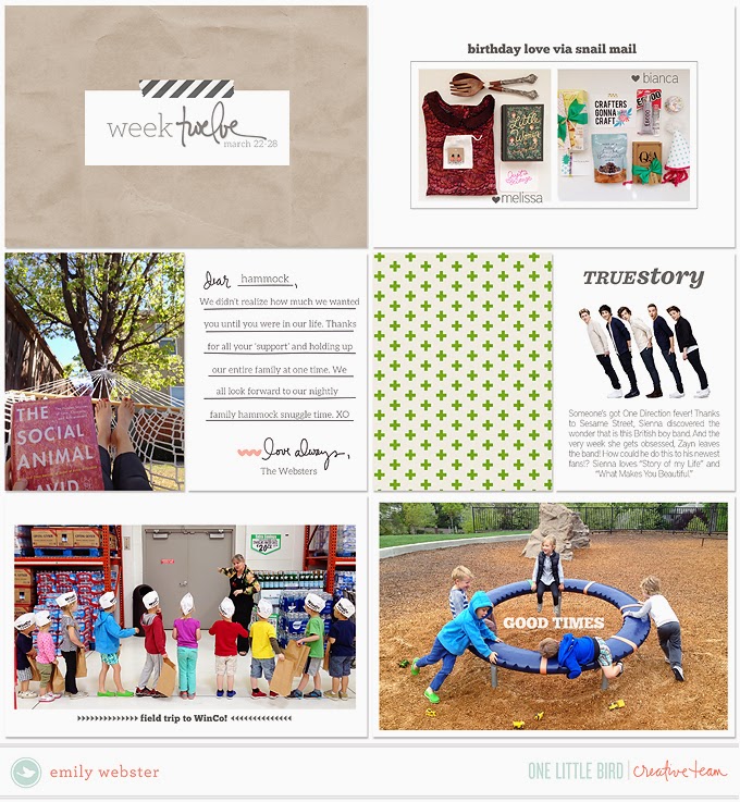
Tuesday, August 25, 2015

the latest and greatest - one little bird edition

Summer layouts are so fun to make! They're light, airy, bright and colorful! They're also time consuming because we're doing so many fun things and all those things have to be documented! I've done more inserts this summer than ever before- inserts are my new jam (but that's for another post). Here are some full size summer layouts using One Little Bird products:

I love the color scheme for this collection called "Cabana"


This layout only has a few elements from the "Frolic" collection, but that's how I roll- lots of pictures, a few pretty things and call it good.


I LOVE a patriotic color scheme. I used red white and blue with a hint of mint to document our summer vacation in Utah. This kit, "Nosh" was meant to be all about food, but I went a different direction. 


Doesn't this scream summer? Our day at the state fair was a big deal to my little kids, so we had to make a whole layout documenting the fun. The kit, "Ready, Set, Go" is full of oranges and yellows that just really get me in that summer vibe. The journaling cards are some of my favorite, too.

Saturday, May 9, 2015

why drop shadows are da bomb

Drop shadows are really big in the digital scrapbooking world. The shadows are the key to making something look 3D- making it look like it's not digital, but like there's a real element on the page. I didn't get into drop shadows until recently and I feel like it's a game changer. Now, I don't use a lot of elements typically like a traditional digital scrapbooker would. My pocket page style is very minimalist and empty of too many doo-dads. BUT, here's where drop shadows come in handy. I like to use a lot of white text or photoshop brushes on top of pictures or patterned paper, but sometimes the white is a bit tricky to see. This is where a subtle drop shadow comes in. This is the title card I am currently working on. I wanted to use this light tan color paper with a slight texture from the One Little Bird Suncatcher paper set with white text, but the text was a little bit lost:


So for each layer (the text and the box around it) I added a drop shadow- used the linear burn mode, and did a 15% opacity with a 3px distance and size. Just eyeball it until it looks right. I try to keep it nice and subtle.


So here you have the finished card. Clean, simple and slightly easier to read than the first version.


As an FYI, this font is called AW Conqueror Carved and I have been using it all the time because I love it so much. I set the tracking to 100 to space the letters out a little more. I like the look it gives. Happy scrapping and shadowing!

If you're looking for a detailed post on shadowing, check out THIS from the OLB blog.

Wednesday, April 15, 2015

OLB Creative Team Work

Hello! I've been in a creative funk lately. It comes and goes and it's pretty natural, so I don't worry. But I just finished a layout for One Little Bird and thought I'd share the last few I've created.

My style gravitates towards lots of pictures and white space and little patterns/embellishments BUT without those embellishments it wouldn't be scrapbooking, it'd just a be a photo album, right? So I'm trying to embrace the pretty stuff and be ok with not having 8 pictures on each page. The struggle is real, people! ;-)

(my first layout has 8 pictures on it! Oops!!)